- 9673
- 597
- 9
- 18
- 0
- Help Ukraine
About the solution
The ClearRx system Adler designed for Target includes bottles for pills and liquids and a measuring syringe.
So the new bottle created by Adler should have all the following contents: The bottle should have easy I.D.; The name of the drug is printed on the top of the bottle, so it’s visible if kept in a drawer; The red color of the bottle is Target’s signature. Should have as well an information hierarchy.
The inventor divided the label into primary and secondary positions, separated by a horizontal line. The most important information (drug name, dosage, intake instructions) is placed above the line, and less important data (quantity, expiration date, doctor’s name) is positioned below, an upside down method which eliminates waste and makes life easier for pharmacists.
Adler developed as well a system of six colored rubber rings that is attached to the neck of the bottle, so family members can choose their own identifying shade, that way, medications in a shared bathroom will never get mixed up. A card with more detailed information on a drug (common uses, side effects) is now tucked behind the label. And finally, she decided to clear some warnings on the bottle because many of the existing warnings don’t make much sense.
Adapted from: http://nym.ag/2hL21x3
This solution shall not include mention to the use of drugs, chemicals or biologicals (including food); invasive devices; offensive, commercial or inherently dangerous content. This solution was not medically validated. Proceed with caution! If you have any doubts, please consult with a health professional.
DISCLAIMER: This story was written by someone who is not the author of the solution, therefore please be advised that, although it was written with the utmost respect for the innovation and the innovator, there can be some incorrect statements. If you find any errors please contact the patient Innovation team via info@patient-innovation.com
-
-
421
-
0
-
4427

Patient Sam Jactel designed an app - Ayble health - that allows patients to create a personalised plan for a healthier gut.
(SELF)-CARE: EATING: Eating independently.
(SELF)-CARE: DRINKING: Drinking independently.
(SELF)-CONTROL: BOWEL CONTINENCE: Maintaining bowel continence
CAREGIVING
Cooking
Social interaction
Chron's Disease
oesophageal disorders (oesophagitis, gastroesophageal reflux disease, gastroesophageal sphincter insufficiency)
Inflammatory Bowel Disease
App (Including when connected with wearable)
Strategy/Tip
Abdominal pain
Weight loss
Indigestion (dyspepsia)
Vomiting (Regurgitation)
Abdominal swelling or mass
Weight gain
Enhancing health literacy
Promoting self-management
Enhancing digestive function
Manage Medication
Preserving Organ Function
Alleviating Allergies
Preventing (Vaccination, Protection, Falls, Research/Mapping)
Raise awareness
Caregiving Support
Gastroenterology
General and Family Medicine
General Surgery
Internal Medicine
Pediatrics
United States
-
-
-
469
-
0
-
4766

Diabmate
CAREGIVING
(SELF)-CARE: EATING: Eating independently.
(SELF)-CARE: DRINKING: Drinking independently.
COMMUNICATION: Communicating, whether by speaking, listening, or other means
diabetes type 1
diabetes type 2
Gestational Diabetes
App (Including when connected with wearable)
AI algorithm
Muscle weakness
Excessive thirst or hunger
Fatigue
Enhancing health literacy
Promoting self-management
Managing diabetes
Manage Medication
Preserving Organ Function
Building Supportive Community Relationships
To improve Treatment/Therapy
Preventing (Vaccination, Protection, Falls, Research/Mapping)
Raise awareness
Caregiving Support
Endocrinology
General and Family Medicine
Gynecology and Obstetrics
Internal Medicine
Pediatrics
France
-
-
-
385
-
0
-
4179
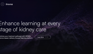
Tim Fitzpatrick founded IKONA Health- a free platform that enhances health literacy throughout the entire kidney disease journey.
CAREGIVING
Renal Disorders (Renal Obstructive Disorders, Renal Structural Abnormalities)
App (Including when connected with wearable)
5 Senses support devices: (glasses, hearing aids, headphones...)
AI algorithm
Strategy/Tip
Website
Enhancing health literacy
Promoting self-management
Manage Medication
Preserving Organ Function
Building Supportive Community Relationships
Promoting inclusivity and social integration
To improve Treatment/Therapy
Preventing (Vaccination, Protection, Falls, Research/Mapping)
Raise awareness
Caregiving Support
General and Family Medicine
Nephrology
Urology
United States
-